As an art and design college located in the heart of San Francisco, California College of the Arts (CCA) offers a student experience unlike any other; however, CCA’s previous viewbooks * were outdated and lacked the compelling attributes of a new brand look and voice taking shape within the brand team.
Two new viewbooks for prospective undergraduate and graduate students represented an opportunity to reflect the brand evolution, allow CCA’s student work to tell the story, and champion the school’s creative and academic ethos in an exciting new way.
* A viewbook offers prospective college students their first impression of a school. These highly popular marketing pieces are meant to provoke interest and deliver an authentic but succinct “view” of what makes a college unique and worthy of investment.
SCOPE
Creative direction – Design strategy – Graphic design – Segment marketing – Client presentation – Print production
TEAM
Design Direction – Joel Gregory
Content Strategy – Stephanie Smith
Photography – Nicholas Lea Bruno
Production – Connie Jeung-Mills
Writing – Jackie Mantey

01
Undergraduate Viewbook
“BETTER BY THE BAY” CONCEPT
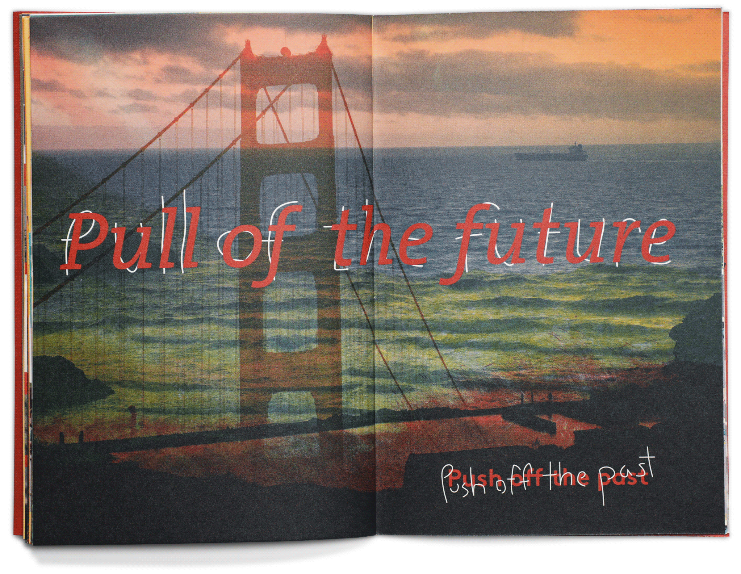
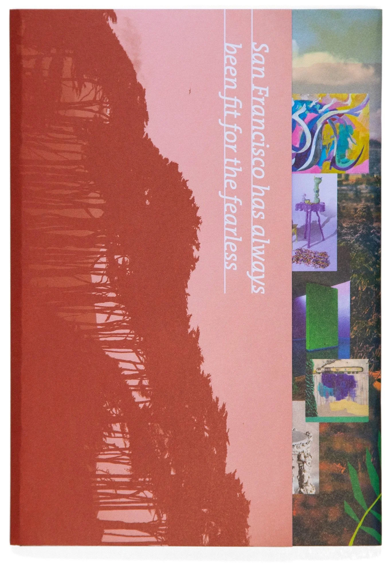
The new brand messaging took inspiration from the college’s century-old legacy in the Bay Area, renowned for its generative and innovative creative energy. As the only AICAD-accredited school in Northern California, we wanted to uplevel the opportunities only available on the West Coast, while honing in on an audience eager to experiment with new forms, challenge expectations, and become leaders of social change.
With this in mind, the undergraduate viewbook content was created with a focus on the differentiators of being in the Bay as a college student, immersed in the vibrant community that has deep roots in activism and art. Imagery leaned into this sense of place, and a vibrant red acted as a conceptual complement to CCA’s primary brand color, teal. Red inspires a sense of action and harkens to the Golden Gate Bridge as well as the recognizable red facade of CCA’s main campus building.


AUDIENCE-NOW DESIGN THINKING
The undergraduate viewbook is targeted toward high school juniors and seniors. This piece needed to be written and designed to meet this audience where they’re at, speaking to their top concerns for, or excitement about, the immediate future — “What will college be like for me here?”


CCA encourages students to arrive with open minds: ready to experiment, fail, and make a mess as they learn to navigate ambiguity and make art that matters. To express this, the viewbook’s design system employs early-sketch or prototype-style doodles, layered imagery, and surprising juxtapositions to create a sense of engaged experimentation that is a key value proposition of CCA’s curriculum, community, and city life.


02
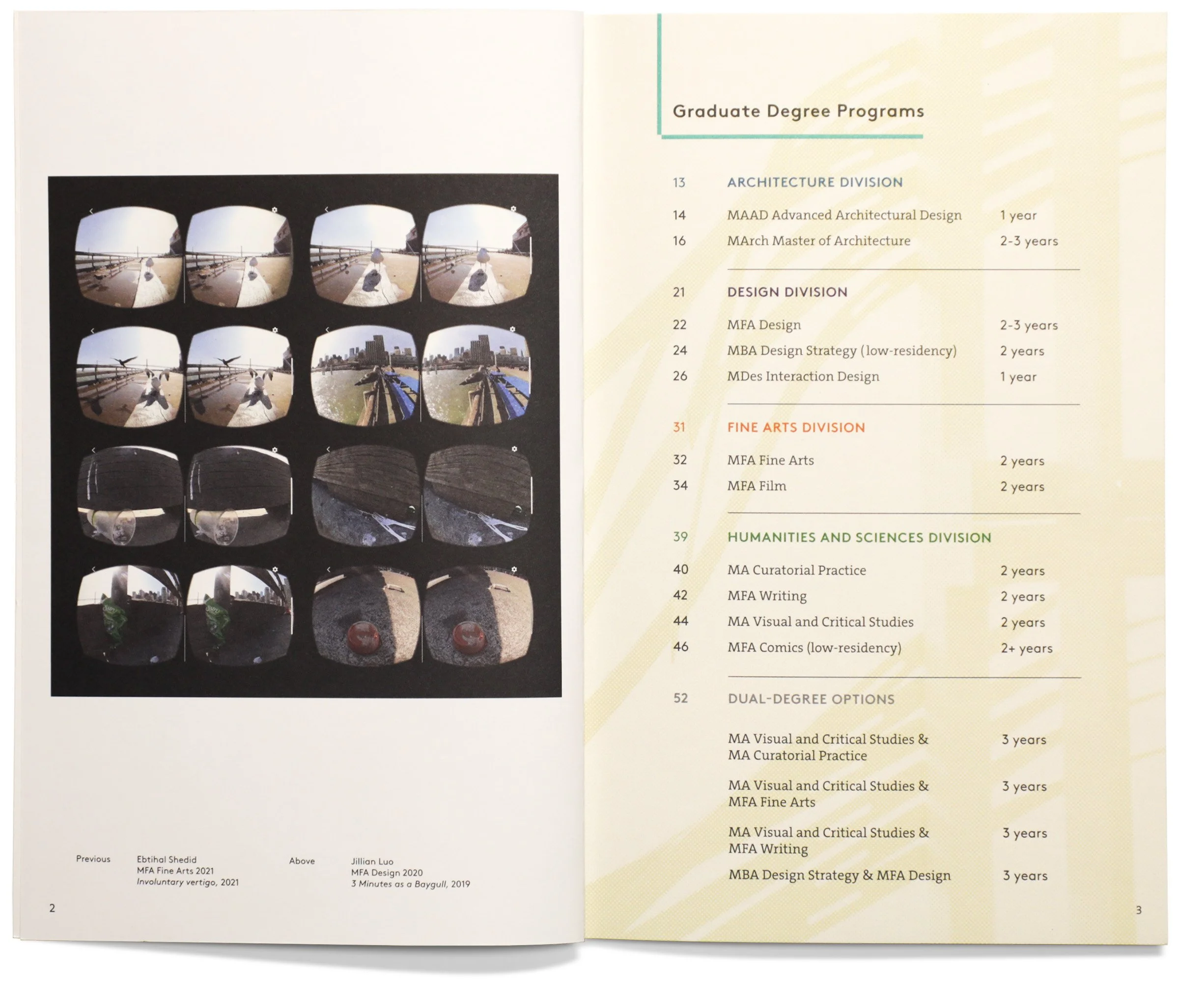
Graduate Viewbook
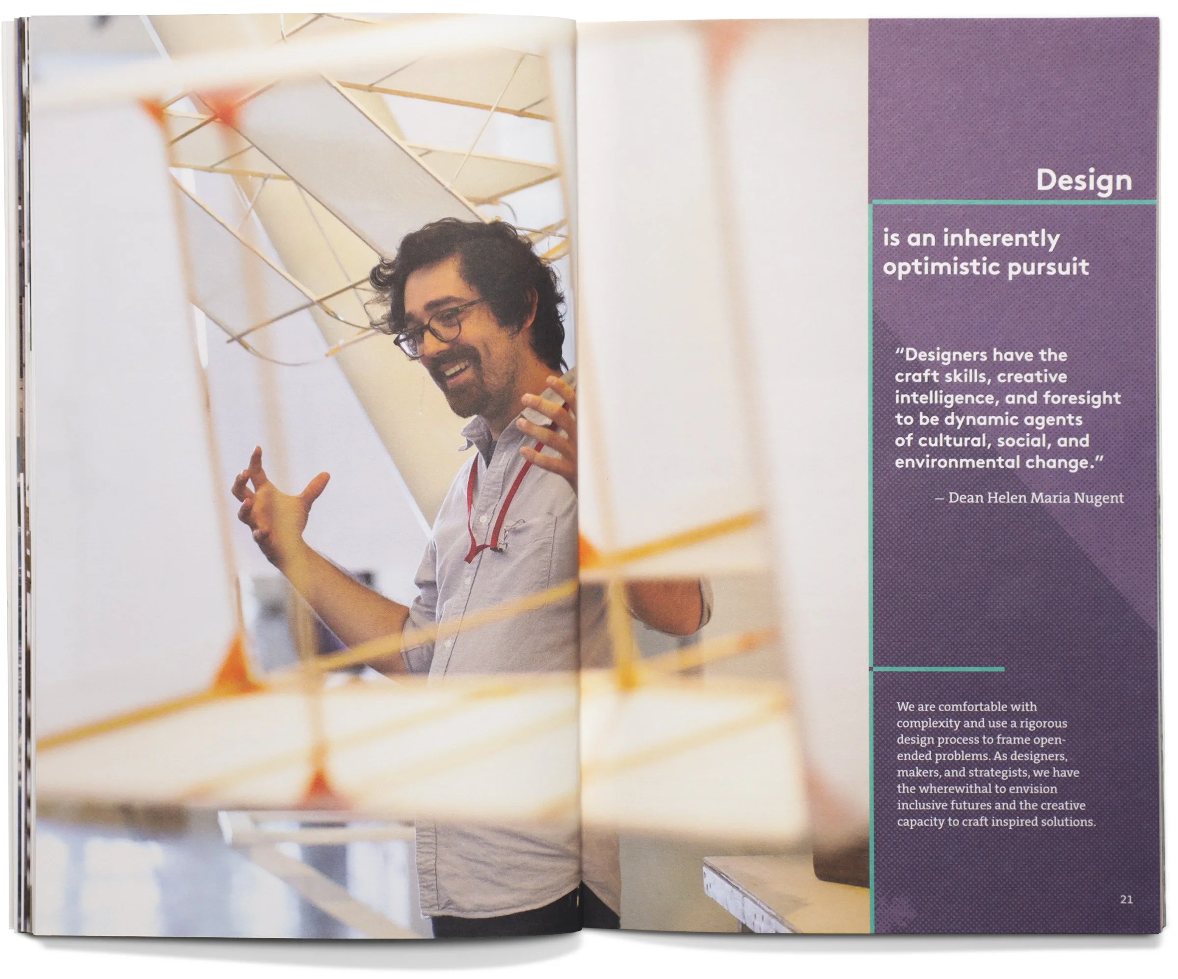
“PLACE/MAKING” CONCEPT
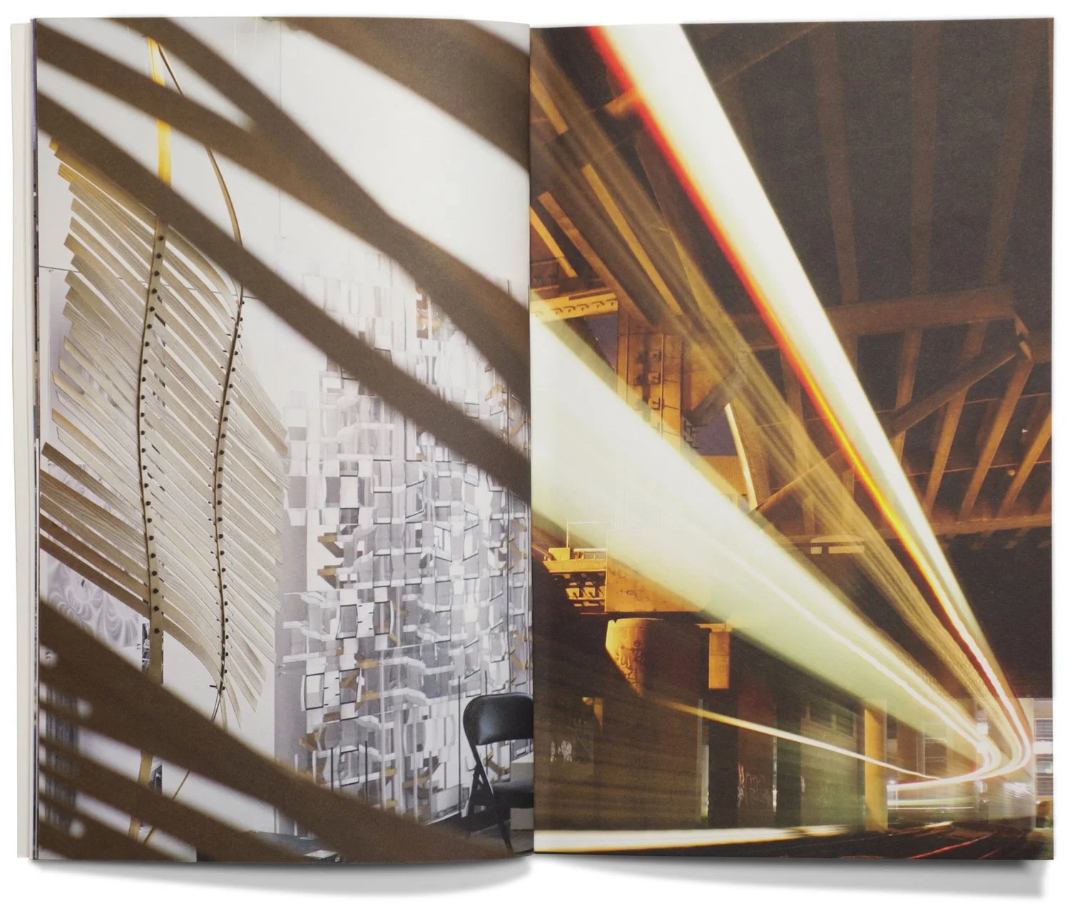
Our graduate viewbook took the brand evolution in an elevated direction, promoting the “place” benefits of attending college in the Bay Area (the driving factor of the undergraduate viewbook) and weaving an enhanced, exploratory “making” component through the messaging and design.
CCA’s graduate experience is a unique opportunity to dive deeper into interdisciplinary inquiry, studio practice, and critical theory. This concept called for strong visuals and nutritious content.
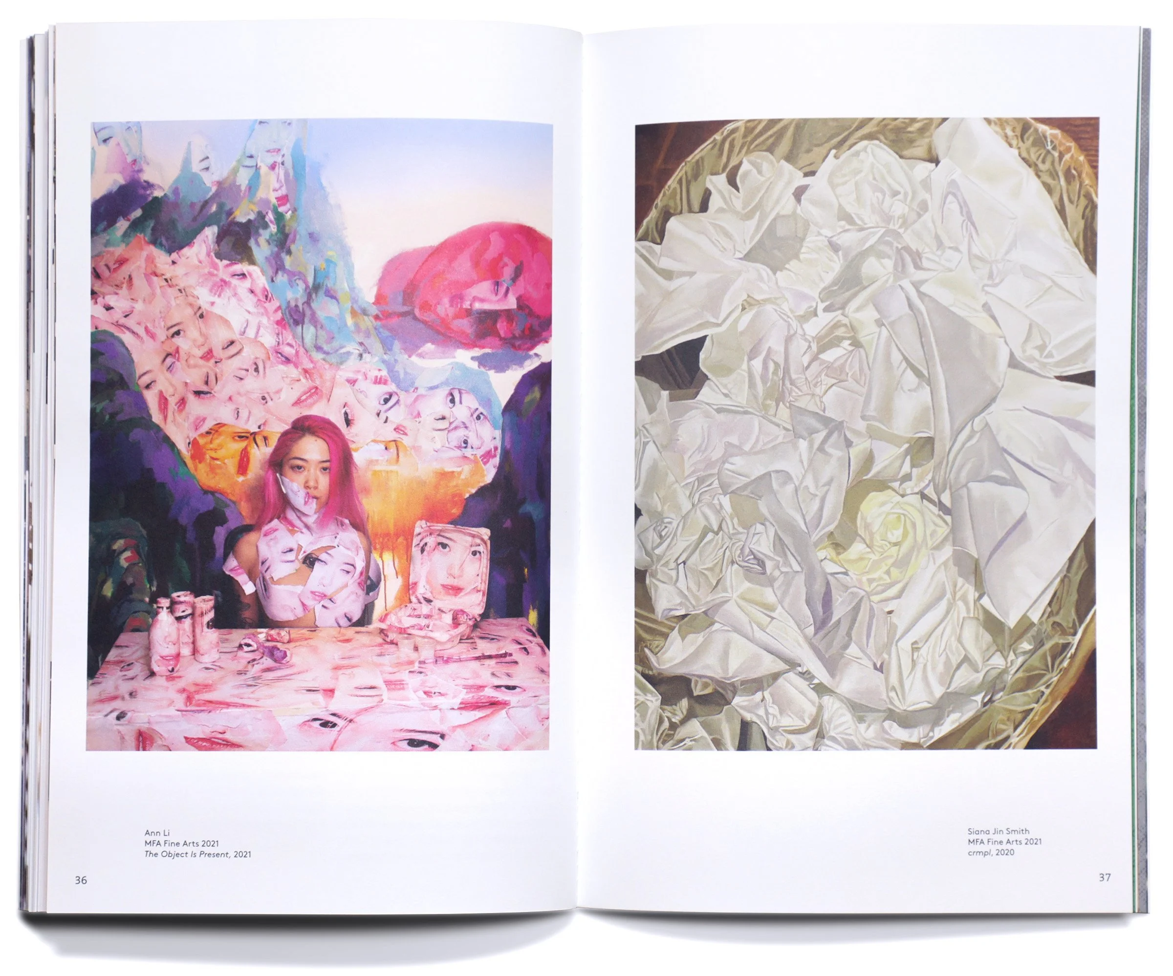
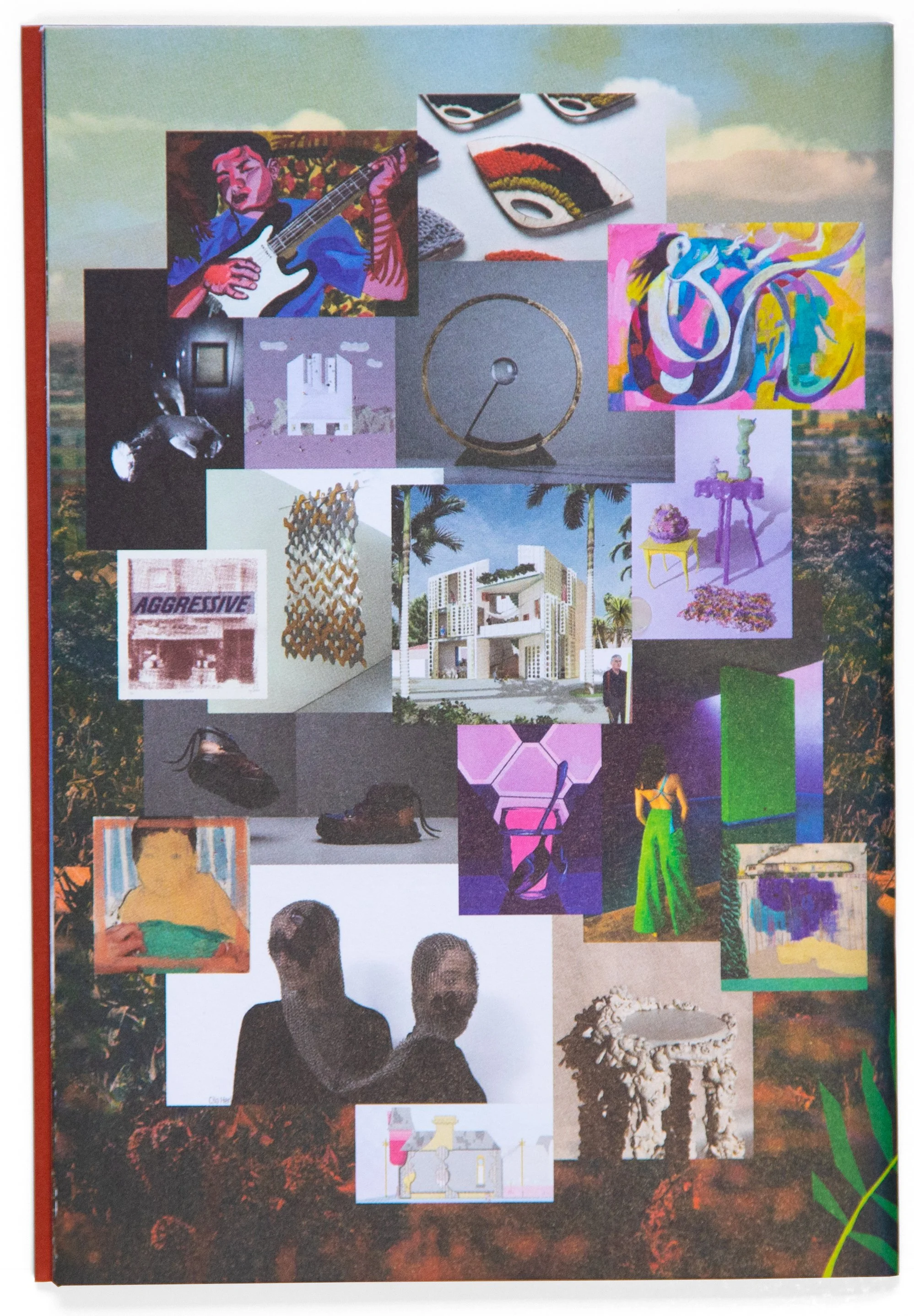
Asynchronous image representations paired a campus or Bay Area “place” with an act of “making.” The unexpected but sophisticated combinations evoked a hybrid of experimentation, rigor, and tangible outcome that is distinctive of the college’s graduate pedagogy.


AUDIENCE-FUTURE DESIGN THINKING
The prospective graduate student audience is focused on learning the career-long benefits of developing their practice at one particular school or program over another. For this viewbook to be effective, readers would need to learn something of value about their specific master’s degree program of interest. We dedicated more pages than the typical viewbook to the piece, accommodating divisional sections that dig deeper into the benefits and outcomes of each CCA graduate division and programs within it.


Visuals supported and prioritized real outcomes-based storytelling, voices, and opportunities, while also metaphorically speaking to the action-oriented and experimental nature of CCA graduate pedagogy. For example, the cover artwork features a grid pattern stamped with holographic foil, which shifts in color depending on light and the viewer’s perspective, demonstrating the curriculum’s focus on seeing a problem from all angles before devising the best creative solution.